
前端三剑客 —— CSS (第四节)


.png)


目录
内容回顾:
1.常见样式
2.特殊样式
特殊样式
过滤效果
动画效果
动画案例:
渐变效果
其他效果:
多列效果
字体图标(icon)
内容回顾:
1.常见样式
text-shadow x轴 y轴 阴影的模糊程度 阴影的颜色
box-shadow
border-radio 实现圆角
margin 内边距
padding 外边距
background
2.特殊样式
媒体查询:@media
自定义字体:@font-face {
font-family:自定义名称;
src:url(“字体的路径”);
}
选择{
font-family:自定义名称;
}
转换:transform
移动:translate()
旋转:rotate()
缩放:scale()
翻转:skew()
综合:matrix()
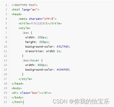
特殊样式
过滤效果
从一个状态变为另一个状态的过程,要想有过滤效果,我们就需要又触发条件,通常触发的条件为鼠标移动到元素上(hover)。
单项过渡
多项过渡
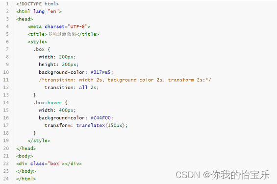
transition这个属性的值

过渡效果比较
.box {
width: 200px;
height: 200px;
background-color: #317FE5;
/*transition: width 5s ease 2s;*/
/*transition: width 3s linear;*/
/*transition: width 3s ease-in;*/
/*transition: width 3s ease-in-out;*/
transition: width 3s ease-out;
}
.box:hover {
width: 500px;
}
动画效果
在CSS3中提供了基于CSS动画效果,我们需要先定义动画,然后再使用动画。
定义动画使用@keyframes,从而使用动画animate
动画效果
/*.box {*/
/* width: 200px;*/
/* height: 200px;*/
/* background: #317FE5;*/
/* transition: transform 2s;*/
/*}*/
/*.box:hover {*/
/* transform: translateX(100px);*/
/*}*/
/* 定义动画 */
@keyframes myAnimate {
from {
left: 5px;
background: #317FE5;
}
to {
left: 500px;
background: red;
}
}
.box {
width: 200px;
height: 200px;
background: #317FE5;
animation: myAnimate 5s;
position: absolute;
left: 5px;
top: 5px;
}
另一个效果
动画效果
/* 定义动画 */
@keyframes myAnimate {
0% {
left: 5px;
top: 5px;
}
25% {
left: 500px;
top: 5px;
}
50% {
left: 500px;
top: 200px;
}
75% {
left: 5px;
top: 200px;
}
100% {
left: 5px;
top: 5px;
}
}
.box {
width: 200px;
height: 200px;
background: #317FE5;
animation: myAnimate 5s;
position: absolute;
left: 5px;
top: 5px;
}
动画属性
| 属性 | 描述 | 值 |
| @keyframes | 规定动画。指定 | css样式 |
| animation | 所有动画属性的简写属性,除了 animation-play-state 属性。 | 动画名称 |
| animation-name | 规定 @keyframes 动画的名称。 | 动画名称 |
| animation-duration | 规定动画完成一个周期所花费的秒或毫秒。默认是 0。 | 数值 |
| animation-timing-function | 规定动画的速度曲线。默认是 "ease"。 | ease-in-out、linear、ease、ease-in、ease-out |
| animation-delay | 规定动画何时开始。默认是 0。 | 数值 |
| animation-iteration-count | 规定动画被播放的次数。默认是 1。 | 数值或者infinite |
| animation-direction | 规定动画是否在下一周期逆向地播放。默认是 "normal"。 | normal、alternate |
| animation-play-state | 规定动画是否正在运行或暂停。默认是 "running"。 | paused、running |
| animation-fill-mode | 规定对象动画时间之外的状态。 | none、forwards、backwards、both |
动画属性介绍
.box {
width: 200px;
height: 200px;
background: #317FE5;
position: absolute;
top: 5px;
left: 5px;
/*animation: myMove 5s;*/
/* 指定动画名称 */
/*animation-name: myMove;*/
/* 定义动画持续时间,单位是秒或毫秒 */
/*animation-duration: 3s;*/
/* 定义动画执行的效果 */
/*animation-timing-function: ease-in;*/
/* 定义动画执行次数,默认为 1 次,如果希望无限次,则值为 infinite */
/*animation-iteration-count: infinite;*/
/*animation-iteration-count: 1;*/
/* 定义动画的运行方向 */
/*animation-direction: alternate-reverse;*/
/*animation-direction: alternate;*/
/*animation-play-state: paused;*/
animation: myMove 3s ease-in infinite alternate;
}
@keyframes myMove {
from {
/*background: #317FE5;*/
left: 5px;
top: 5px;
}
to {
/*background: red;*/
left: 200px;
top: 5px;
}
}
动画案例:
定义两个圆,一个圆逆时针旋转,另一个圆顺时针旋转。
下图是定义分析

动画的案例
.outer {
width: 300px;
height: 300px;
background: url("image/5.jpeg") no-repeat center center;
overflow: hidden;
border-radius: 50%;
/*transform: translateY(50%);*/
position: absolute;
left: 50%;
top: 50%;
margin-top: -150px;
margin-left: -150px;
animation: outerAnimate 5s linear infinite;
}
.inner {
width: 200px;
height: 200px;
background: url("image/7.jpeg") no-repeat center center;
/*transform: translate(25%, 25%);*/
border-radius: 50%;
position: absolute;
left: 50%;
top: 50%;
margin-left: -100px;
margin-top: -100px;
animation: innerAnimate 3s linear infinite;
}
@keyframes outerAnimate {
from {
transform: rotate(360deg);
}
to {
transform: rotate(0deg);
}
}
@keyframes innerAnimate {
from {
transform: rotate(0deg);
}
to {
transform: rotate(360deg);
}
}
渐变效果
在CSS3中提供了可以让两种或多种颜色之间的显示平稳过渡。我们只需要使用background-image:linear-gradients 属性指定即可。它的语法为:

简单示例

其他效果:
渐变效果2
.box {
width: 300px;
height: 300px;
margin: 50px auto;
border: 1px solid #333333;
border-radius: 50%;
/* 可以指定渐变的角度 */
/*background-image: linear-gradient(180deg, #ff0000, yellow);*/
/* 可以指定渐变的透明度 */
/*background-image: linear-gradient(to right, rgba(255,0,0,.5), rgba(255, 255, 0, 0.5));*/
/* 重复的线性渐变 */
/*background-image: linear-gradient(red, yellow 10%, green 20%);*/
/* 径向渐变 */
background-image: radial-gradient(red, yellow);
}
多列效果
在CSS3中提供了将文本内容设计成像报纸一样的多列布局。
多列效果
.box {
column-count: 3;
}
下面的数据呈现3列展示
“当我年轻的时候,我梦想改变这个世界;当我成熟以后,我发现我不能够改变这个世界,我将目光缩短了些,决定只改变我的国家;当我进入暮年以后,我发现我不能够改变我们的国家,我的最后愿望仅仅是改变一下我的家庭,但是,这也不可能。当我现在躺在床上,行将就木时,我突然意识到:如果一开始我仅仅去改变我自己,然后,我可能改变我的家庭;在家人的帮助和鼓励下,我可能为国家做一些事情;然后,谁知道呢?我甚至可能改变这个世界。”
字体图标(icon)

阿里 有阿里图标库 可在里面进行下载图标和代码 (百度搜索阿里图标库即可找到)

")


")