
纯前端个人主页分享
云川
* {
margin: 0;
padding: 0;
}
body {
background-image: url('img.png'); /* 更换为你的背景图片路径 */
background-size: cover;
background-position: center;
margin: 0;
font-family: Arial, sans-serif;
}
.main {
display: flex;
justify-content: center;
align-items: center;
min-height: 100vh;
}
.box {
background-color: rgba(255, 255, 255, 0.8);
padding: 20px;
border-radius: 10px;
box-shadow: 0 4px 8px rgba(0, 0, 0, 0.2);
max-width: 400px;
width: 100%;
text-align: center;
}
@-webkit-keyframes 'Box' {
from {
box-shadow: 0 1px 5px rgba(0, 0, 0, 0);
}
to {
box-shadow: 0 1px 60px rgba(20, 50, 18, 0.2);
}
}
.info {
display: flex;
width: 100%;
flex-direction: column;
align-items: center;
}
.head {
position: relative;
width: 100px;
height: 100px;
margin-top: 45px;
margin-bottom: 20px;
border-radius: 52px;
background-image: linear-gradient(to right, #0acffe 0%, #495aff 100%);
padding: 1px;
}
.head img {
border-radius: 50%;
width: 100px;
height: 100px;
}
.head:hover {
transition: 1s;
transform: scale(1.2);
}
/* 介绍部分 */
.jieshao {
display: flex;
justify-content: center;
align-items: center;
margin: 10px 0;
}
.apps {
display: flex;
align-items: center;
margin: 10px 0;
background-color: #03a9f4;
padding: 5px;
border-radius: 20px;
box-shadow: 0 1px 15px rgba(0, 0, 0, 0.3);
}
.apps img {
width: 25px;
height: 25px;
border-radius: 15px;
margin-right: 5px;
}
.apps h2 {
font-size: 15px;
font-weight: bold;
color: white;
}
.jie-img1 {
width: 40px;
height: 40px;
margin-left: 10px;
}
.jie-img1:hover {
transition: 1s;
transform: scale(1.1);
}
.jieshao h1 {
font-size: 16px;
text-align: center;
color: #646464;
margin-left: 10px;
}
.jieshao h3 {
font-size: 14px;
text-align: center;
color: #646464;
}
.jieshao a {
text-decoration: none;
}
.jieshao h1:hover {
color: transparent;
background-image: linear-gradient(to right, #0acffe 0%, #495aff 100%);
-webkit-background-clip: text;
font-size: 18px;
transition-duration: 0.5s;
}
.div1 {
height: 100%;
width: 100%;
background-color: #60c2e0;
position: absolute;
margin: 0 auto;
text-align: center;
line-height: 100px;
}
.pic {
width: 100px;
height: 100px;
border-radius: 50px;
transition: all 0.2s;
border: 0px solid #fff;
}
.sign {
position: absolute;
bottom: 0;
right: 0;
display: flex;
width: 25px;
height: 25px;
background-image: linear-gradient(to right, #0acffe 0%, #495aff 100%);
border: 2px solid #fff;
border-radius: 15px;
justify-content: center;
align-items: center;
transition: all 0.3s;
}
.sign:hover {
background-image: linear-gradient(to right, #43e97b 0%, #38f9d7 100%);
}
.box1 {
width: 100%;
max-width: 800px;
background-color: #fff;
padding: 0px;
box-shadow: 0 1px 15px rgba(60, 90, 10, 0.15);
border-radius: 25px;
margin-top: 10px;
transition: all 0.5s;
}
.box1:hover {
margin: 10px;
padding: 5%;
box-shadow: 0 10px 50px rgba(10, 200, 60, 0.25);
}
.box2 {
width: 33%;
background-color: #29bedb;
padding: 2px;
box-shadow: 0 1px 15px rgba(20, 50, 18, 0.2);
border-radius: 25px;
display: flex;
flex-direction: row;
-webkit-animation-name: "D1";
-webkit-animation-duration: 4s;
-webkit-animation-iteration-count: 1;
}
@-webkit-keyframes 'D1' {
from {
width: 30%;
}
to {
width: 33%;
}
}
.box3 {
width: 65%;
background-color: #4da2f7;
padding: 2px;
box-shadow: 0 1px 15px rgba(50, 50, 58, 0.2);
border-radius: 25px;
display: flex;
flex-direction: row;
-webkit-animation-name: "D2";
-webkit-animation-duration: 4s;
-webkit-animation-iteration-count: 1;
}
@-webkit-keyframes 'D2' {
from {
width: 35%;
}
to {
width: 65%;
}
}
.box4 {
width: 85%;
background-color: #864df7fc;
padding: 2px;
box-shadow: 0 1px 15px rgba(20, 50, 18, 0.2);
border-radius: 25px;
display: flex;
flex-direction: row;
-webkit-animation-name: "D3";
-webkit-animation-duration: 4s;
-webkit-animation-iteration-count: 1;
}
@-webkit-keyframes 'D3' {
from {
width: 45%;
}
to {
width: 85%;
}
}
.box5 {
width: 55%;
background-color: #f74dbcfc;
padding: 2px;
box-shadow: 0 1px 15px rgba(20, 50, 18, 0.2);
border-radius: 25px;
display: flex;
flex-direction: row;
-webkit-animation-name: "D4";
-webkit-animation-duration: 4s;
-webkit-animation-iteration-count: 1;
}
@-webkit-keyframes 'D4' {
from {
width: 30%;
}
to {
width: 55%;
}
}
.box6 {
width: 40%;
background-color: #f7cf4dfc;
padding: 2px;
box-shadow: 0 1px 15px rgba(20, 50, 18, 0.2);
border-radius: 25px;
display: flex;
flex-direction: row;
-webkit-animation-name: "D5";
-webkit-animation-duration: 4s;
-webkit-animation-iteration-count: 1;
}
@-webkit-keyframes 'D5' {
from {
width: 30%;
}
to {
width: 40%;
}
}
.cut {
width: 100%;
height: 3px;
margin: 5px 0;
/* background: linear-gradient(to right,#F74D81FC, #4D57F7FC,#DDF74DFC,#53F74DFC); */
background-image: linear-gradient(-20deg, #b721ff 0%, #21d4fd 100%);
border-radius: 50px;
}
.label {
margin: 8px 0;
font-size: 13px;
color: #424242c4;
}
.label1 {
font-size: 11px;
color: #2d5256c9;
font-weight: 500;
}
.name h1 {
margin: 0 5px;
font-size: 25px;
font-weight: 600;
color: #646464;
transition: all 0.5s;
}
.name h1:hover {
color: transparent;
background-image: linear-gradient(to right, #0acffe 0%, #495aff 100%);
-webkit-background-clip: text;
}
.shu {
width: 55%;
font-size: 10px;
color: #000000b3;
background-color: #05262a30;
box-shadow: 0 1px 15px rgba(20, 50, 18, 0.2);
border-radius: 15px;
padding: 7px;
font-weight: bold;
-webkit-animation-name: "W1";
-webkit-animation-duration: 4s;
-webkit-animation-iteration-count: 1;
}
@-webkit-keyframes 'W1' {
from {
width: 50%;
}
to {
width: 55%;
}
}
}

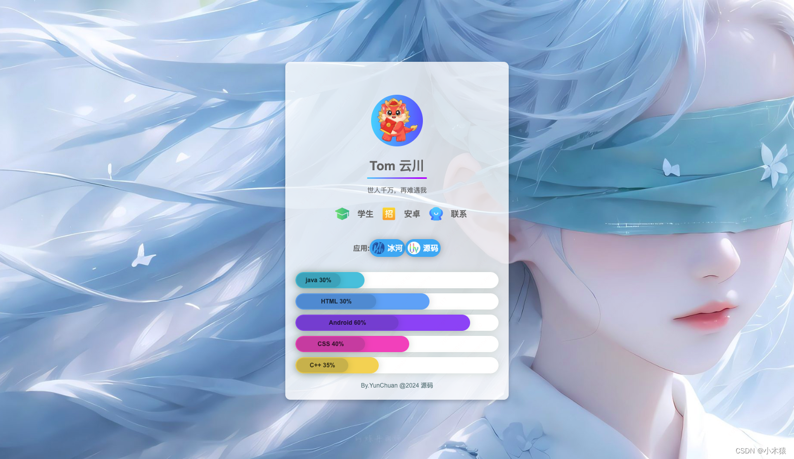
Tom 云川
世人千万,再难遇我

学生

安卓

联系
应用:

冰河

源码
java 30%
HTML 30%
Android 60%
CSS 40%
C++ 35%
By.YunChuan @2024 源码
感兴趣可以一起交流哦~
免责声明:我们致力于保护作者版权,注重分享,被刊用文章因无法核实真实出处,未能及时与作者取得联系,或有版权异议的,请联系管理员,我们会立即处理! 部分文章是来自自研大数据AI进行生成,内容摘自(百度百科,百度知道,头条百科,中国民法典,刑法,牛津词典,新华词典,汉语词典,国家院校,科普平台)等数据,内容仅供学习参考,不准确地方联系删除处理! 图片声明:本站部分配图来自人工智能系统AI生成,觅知网授权图片,PxHere摄影无版权图库和百度,360,搜狗等多加搜索引擎自动关键词搜索配图,如有侵权的图片,请第一时间联系我们,邮箱:ciyunidc@ciyunshuju.com。本站只作为美观性配图使用,无任何非法侵犯第三方意图,一切解释权归图片著作权方,本站不承担任何责任。如有恶意碰瓷者,必当奉陪到底严惩不贷!


