
HTML-CSS练习例子
HTML CSS 练习
https://icodethis.com
作为前端练习生。不敲代码只看,入门是很慢的,所以直接实战是学习前端最快的途径之一。 这个网站练习HTML
CSS的,可以打开了解一下,可以每天打卡,例子简单,循序渐进,设计的也比较好看。
下面是练习,当然布局的方法有很多,下面是一种。
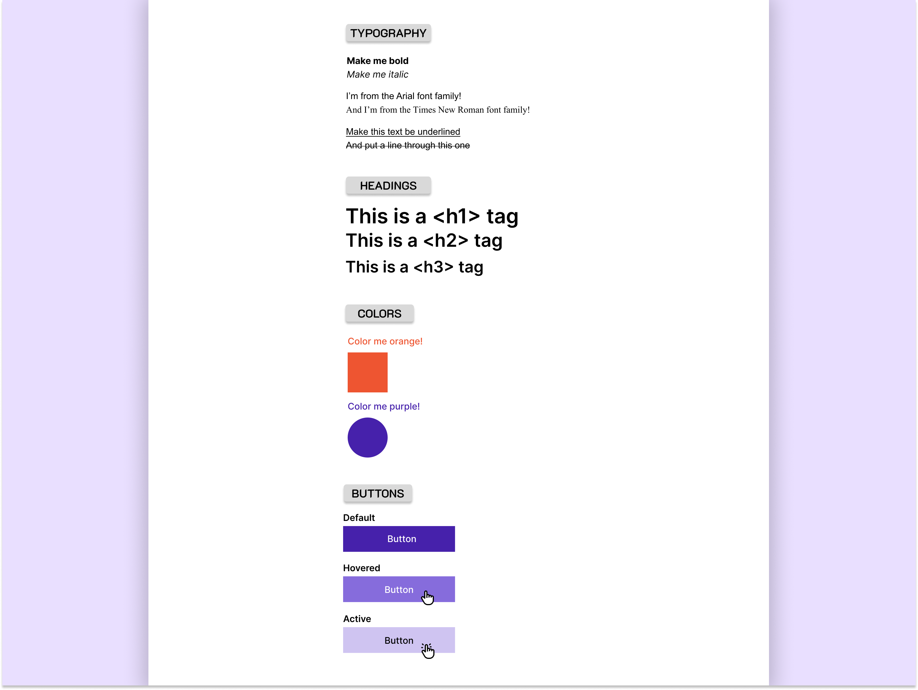
01基础
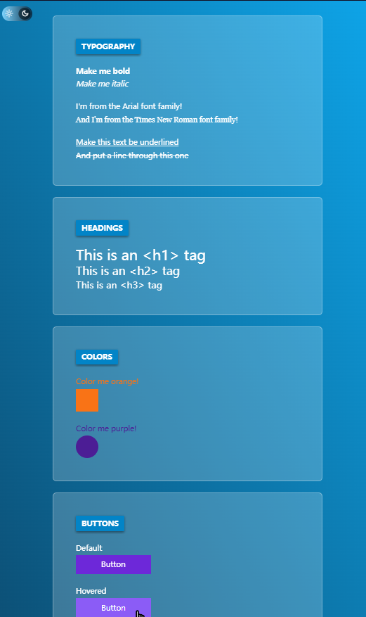
这是第一个练习,但是很多大佬做出了,很多不一样的效果
比如:
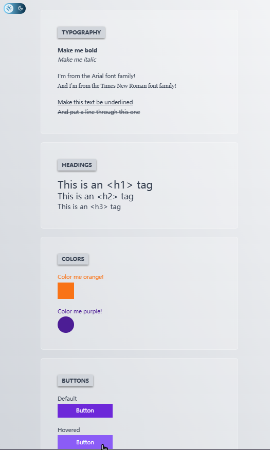
设计稿
代码
基础练习
.main {
width: 400px;
height: 100%;
margin: 0 auto;
/* padding-top: 30px; */
padding: 0 10px;
/* background-color: rgba(241, 77, 186, 0.5); */
}
.content {
padding-top: 30px;
}
p {
margin: 0;
}
.group {
margin-top: 15px;
}
.title {
display: inline-block;
/* padding: 5px ; */
font-size: 15px;
font-weight: 600;
text-align: center;
padding: 0 10px;
/* margin-bottom: 20px; */
box-shadow: 0 2px 3px #7b7878;
border-radius: 3px;
background-color: #d9d9d9;
}
.my-custom-font-Arial {
/* @font-face 加载外部字体 */
/* 'Artal': 这是首选的字体,也就是开发者希望文本显示的字体。'Artal'是一个具体的字体名称,假设它是一个自定义字体或者是用户系统中已安装的字体。如果浏览器在用户的系统中找到了这个字体,它就会使用这个字体来渲染文本。 */
font-family: 'Arial', sans-serif;
}
.my-custom-font-Roman {
font-family: 'Roman', sans-serif;
}
.font-underlined {
text-decoration: underline;
}
.font-through {
text-decoration: line-through;
}
h1,
h2,
h3 {
margin: 0;
}
.color-box {
margin-top: 10px;
}
.color-orange {
color: #ee5531;
}
.square {
width: 50px;
height: 50px;
background-color: #ee5531;
}
.color-purple {
color: #4621ab;
}
.circular {
width: 50px;
height: 50px;
border-radius: 50%;
background-color: #4621ab;
}
h6 {
margin: 0;
margin-bottom: 3px;
}
.button-box {
margin-top: 10px;
}
button {
display: inline-block;
width: 150px;
height: 30px;
border: none;
color: #fff;
background-color: #4621ab;
border-radius: 2px;
}
/* 鼠标悬停时 */
button:hover {
background-color: #866cdc;
}
/* 点击时(按下状态) */
button:active {
background-color: #cfc4f1;
}
TYPOGRAPHY
Make me bold
Make me italic
I'm from the Artal font famil!
And I'm frorm the Times New Ronan fot family! .
Make this text be underlined
And put a Hine through this one
HEADINGS
This isa <h1">> tag
This isa<h2">>tag
This isa <h3">>tag
COLORS
Color me orange!
Color me purple!
BUTTONS
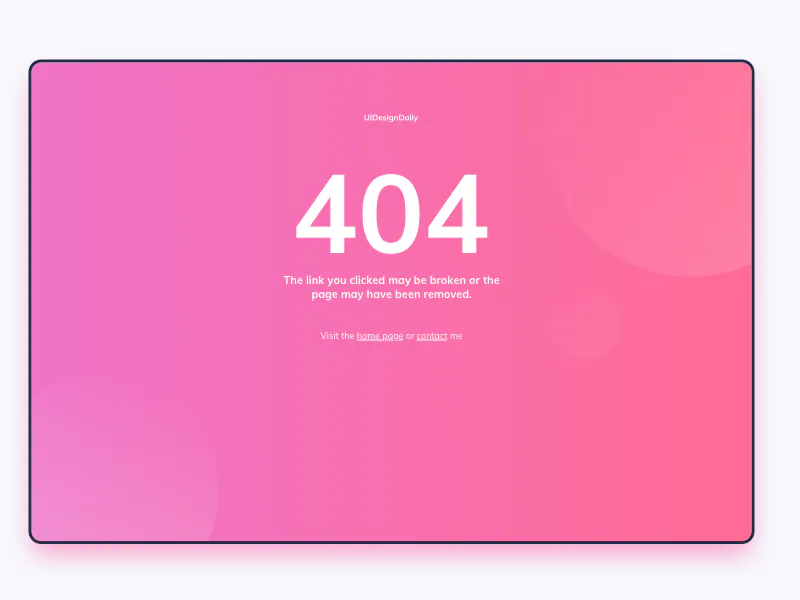
02_404页面
设计搞
代码
Document
.main {
/* border: 1px solid #000; */
position: relative;
width: 100%;
/* 或者设置一个固定宽度 */
height: 100%;
/* 或者设置一个固定高度 */
}
.main-box {
position: absolute;
top: 50%;
/* 使子元素的上边缘位于父元素的中心 */
left: 50%;
/* 使子元素的左边缘位于父元素的中心 */
transform: translate(-50%, 20%);
/* 调整位置,使其居中 */
display: flex;
flex-direction: column;
align-items: center;
width: 800px;
height: 500px;
/* margin: 100px auto; */
/* background-color: rgba(241, 77, 186, 0.5); */
background-image: linear-gradient(to right, #f073c6, #ff6b96);
border-radius: 8px;
border: 2px solid black;
box-shadow: 0 8px 15px rgba(230, 41, 135, 0.5);
}
.content {
width: 50%;
text-align: center;
color: #fff;
/* background-color: rgb(227, 153, 57);
border: 1px solid black; */
}
.one {
margin: 50px 0;
}
.two {
margin: 0 0 20px 0;
font-size: 100px;
font-weight: 700;
}
.three {
margin: 0 0 30px 0;
}
.four {
vertical-align: bottom;
}
a {
color: #fff;
text-decoration: none;
border-bottom: 1px solid #fff;
}
.circular-box {
position: absolute;
width: 800px;
height: 500px;
top: 50%;
/* 使子元素的上边缘位于父元素的中心 */
left: 50%;
/* 使子元素的左边缘位于父元素的中心 */
transform: translate(-50%, 20%);
/* 调整位置,使其居中 */
background-color: rgba(241, 77, 186, 0.2);
overflow: hidden;
}
.circular {
width: 100px;
height: 100px;
border-radius: 50%;
/* background-color: #fff; */
}
.circular-box> :nth-child(1) {
width: 200px;
height: 200px;
position: absolute;
top: 70%;
/* 使子元素的上边缘位于父元素的中心 */
left: -5%;
background-image: linear-gradient(55deg, rgba(255, 255, 255, 0.137), rgba(242, 114, 193, 0.342));
}
.circular-box> :nth-child(2) {
width: 300px;
height: 300px;
position: absolute;
top: -10%;
/* 使子元素的上边缘位于父元素的中心 */
left: 75%;
background-image: linear-gradient(-55deg, rgba(255, 255, 255, 0.137), rgba(242, 114, 193, 0.342));
}
.circular-box> :nth-child(3) {
width: 100px;
height: 100px;
position: absolute;
top: 60%;
/* 使子元素的上边缘位于父元素的中心 */
left: 75%;
background-image: linear-gradient(328deg, rgba(255, 255, 255, 0.137), rgba(242, 114, 193, 0.342));
}
代码2
Document
/*index2.css*/
body{
  margin: 0;
  padding: 0;
}
.container{
  position: absolute;
  top: 0;
  left: 0;
  bottom: 0;
  right: 0;
  display: flex;
  justify-content: center;
  align-items: center;
}
.content{
  overflow: hidden;
  width:95%;
  height: calc(80%/1.4);
  background-image: linear-gradient(90deg, rgb(239,115,199), rgb(255,106,149));
  border: 3px solid rgb(36,46,76);
  border-radius: 13px;
  display:flex;
  flex-direction: column;
  align-items: center;
  position: relative;
  box-shadow: 2px 10px 10px rgba(239, 115, 200, 0.534);
}
.circle1{
  width:250px;
  height: 250px;
  background-image: linear-gradient(270deg, rgba(255, 255, 255, 0.308), rgba(242, 114, 193, 0));
  border-radius: 250px;
  position:absolute;
  left:-40px;
  top:300px;
}
.circle2{
  width:250px;
  height: 250px;
  background-image: linear-gradient(270deg, rgba(255, 255, 255, 0.308), rgba(242, 114, 193, 0));
  border-radius: 250px;
  position:absolute;
  right:-70px;
  top:-50px;
}
.circle3{
  width:70px;
  height: 70px;
  background-image: linear-gradient(270deg, rgba(255, 255, 255, 0.308), rgba(242, 114, 193, 0));
  border-radius: 70px;
  position:absolute;
  left:70%;
  top:50%;
}
p{
  font-size: 10px;
  padding-top: 50px;
  font-family:'Open Sans';
  color:rgba(255, 255, 255, 0.719);
}
h1{
  font-size: 120px;
  font-weight: 600;
  font-family:'Open Sans';
  color:white;
}
h3{
  font-size: 11px;
  font-weight: 501;
  text-align: center;
  font-family:'Open Sans';
  color:rgba(255, 255, 255, 0.685);
}
h5{
  font-size: 10px;
  padding-top: 30px;
  font-family:'Open Sans';
  color:rgba(255, 255, 255, 0.664);
}
a{
  text-decoration: underline;
}
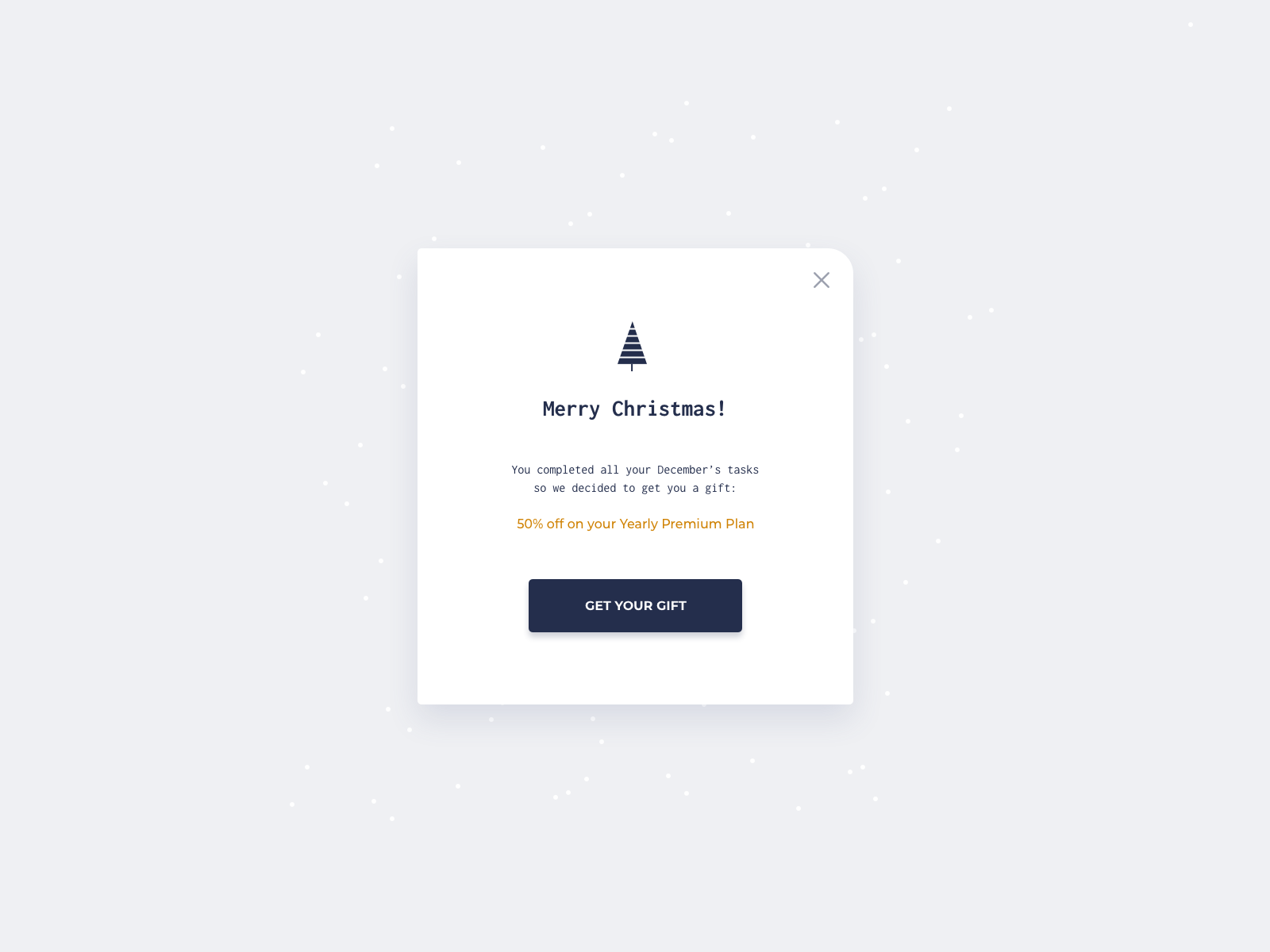
03_Christmas Promo
设计稿
代码
DocumentMerry Christmas !
You completed all your Decenber's tasks
50 we decided to get you a gift:50% off on your Yearly Premium Plan
GET YOUR GIFT

/* Write your CSS code here */body {
    padding: 0;
    margin: 0;
}
.container {
    position: absolute;
    top: 0;
    left: 0;
    bottom: 0;
    right: 0;
    display: flex;
    justify-content: center;
    align-items: center;
    background-color: #eff0f3;
    /* border: 1px solid red;   */
}
.content {
    position: relative;
    background-color: #fff;
    width: 400px;
    height: 450px;
    border-radius: 4px;
    border-top-right-radius: 15px;
    display: flex;
    flex-direction: column;
    align-items: center;
    box-shadow: 4px 10px 10px rgba(53, 64, 99, 0.1);
}
.x {
    position: absolute;
    width: 10px;
    height: 10px;
    right: 20px;
    top: 20px;
    font-size: 20px;
    transform: rotate(45deg);
}
.x::after,
.x::before {
    content: '';
    position: absolute;
    width: 20px;
    height: 2px;
    background-color: rgb(123, 122, 122);
    top: 50%;
    left: 50%;
    transform: translate(-50%, -50%);
}
.x::before {
    transform: translate(-50%, -50%) rotate(90deg);
}
img {
    margin-top: 70px;
    width: 100px;
    height: 130px;
}
/* .tasks{
  text-align: center;
} */
.tasks {
    font-size: 12px;
    color: rgb(126, 125, 123);
    text-align: center;
}
.plan {
    color: orange;
    font-size: 13px;
}
button {
    color: white;
    width: 170px;
    height: 40px;
    margin: 30px;
    font-size: 12px;
    background-color: #242e4c;
    border-radius: 5px;
    box-shadow: 1px 5px 5px rgba(36, 46, 76, 0.5);
}
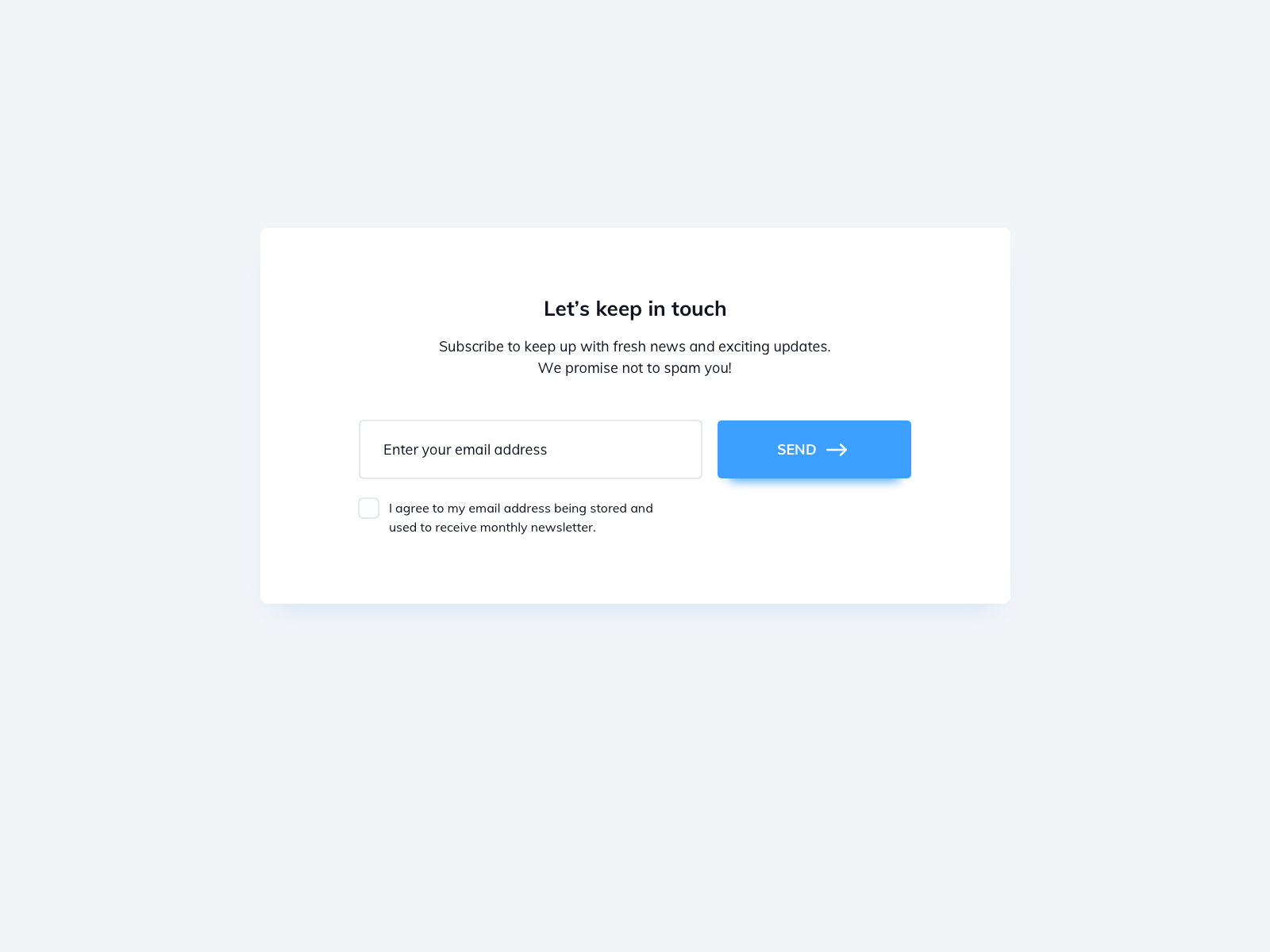
04_Subscribe
设计稿
代码
DocumentLet's keep in touch
Subscribe to keep up with fresh news and exciting updates.
SEND →
We promise not to spam youl!I agree to my email address being stored and
used to reccive monthly ncwsletter.
body {
  padding: 0;
  margin: 0;
}
.container {
  position: absolute;
  top: 0;
  left: 0;
  bottom: 0;
  right: 0;
  display: flex;
  justify-content: center;
  align-items: center;
  background-color: #f2f5f8;
  /* border: 1px solid red; */
}
.content {
  /* position: relative; */
  background-color: #fff;
  width: 600px;
  height: 300px;
  border-radius: 7px;
  box-shadow: 0px 10px 10px rgba(61, 159, 255, 0.1);
  display: flex;
  flex-direction: column;
  align-items: center;
}
.Subscribe {
  font-size: 14px;
  text-align: center;
}
.email {
  width: 230px;
  height: 35px;
  border-radius: 5px;
  padding-left: 15px;
  margin-right: 5px;
  margin-top: 20px;
  border: 1px solid rgb(212, 214, 217);
}
.email-button {
  width: 150px;
  height: 40px;
  color: #fff;
  font-size: 13px;
  border-radius: 5px;
  border: 1px solid rgb(212, 214, 217);
  background-color: rgb(61, 159, 255);
  box-shadow: 0px 5px 5px rgba(61, 159, 255, 0.3);
}
.email-button:hover {
  background-color: rgb(12, 122, 231);
  box-shadow: 0px 5px 5px rgba(61, 159, 255, 0.3);
}
.checkbox-box {
  margin-left: -110px;
}
.input-checkbox {
  display: none;
  /* 隐藏原生的checkbox ,自定义checkbox*/
}
.checkbox-box label {
  position: relative;
  padding-left: 10px;
  cursor: pointer;
  display: inline-block;
  font-size: 12px;
  color: #787f85;
}
.checkbox-box label:before {
  content: '';
  position: absolute;
  left: -15px;
  top: 0;
  width: 15px;
  height: 15px;
  border: 1px solid rgb(212, 214, 217);
  border-radius: 3px;
}
   /* 当checkbox被选中时的样式 */
   .checkbox-box input[type="checkbox"]:checked+label:before {
    background-color: #3d9fff;
    /* 背景颜色,可选 */
}
.checkbox-box input[type="checkbox"]:checked+label:after {
  content: "\2713";
  position: absolute;
  left: -12px;
  top: 0px;
  color: #fff;
  font-size: 14px;
  font-weight: bold;
}
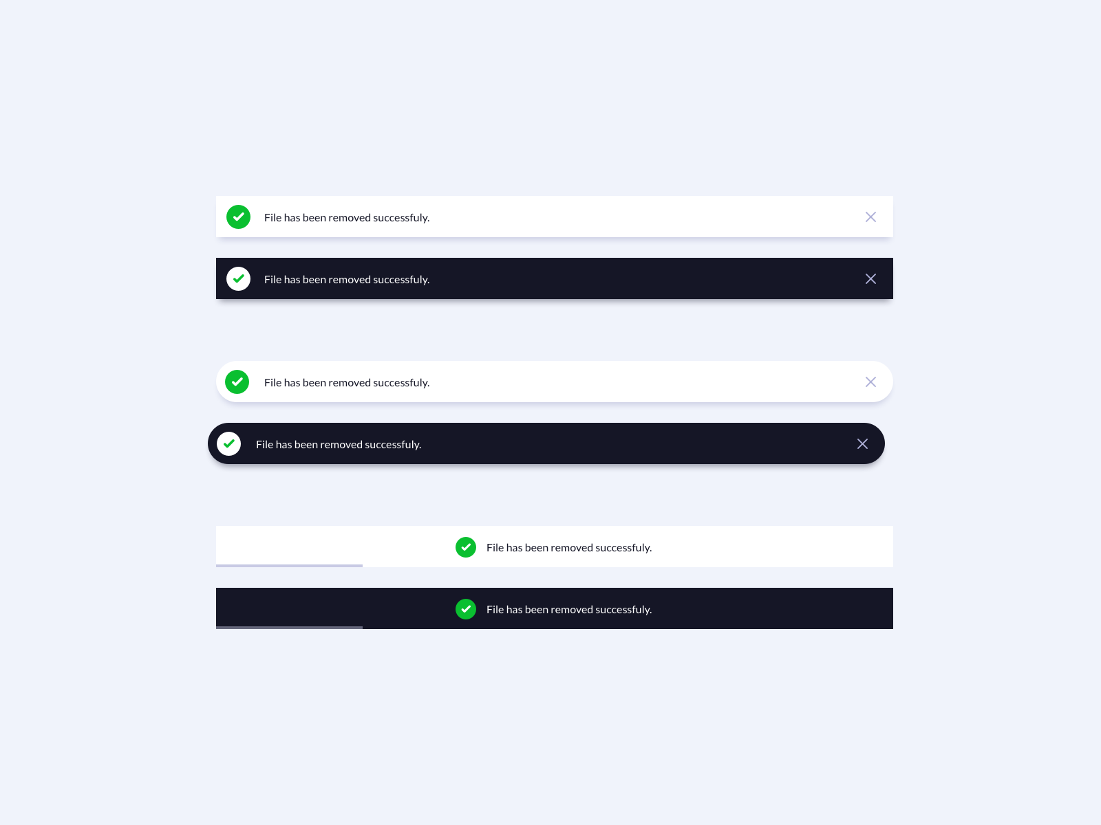
05_Toasts
设计稿
  Document


      File has been removerd succesfully!


      File has been removerd succesfully!


      File has been removerd succesfully!


      File has been removerd succesfully!


      File has been removerd succesfully!


      File has been removerd succesfully!
代码
*{
  box-sizing: border-box;
}
body{
  background: #f5edfd;
  font-family: 'Poppins', sans-serif;
  display: flex;
  align-items: center;
  justify-content: center;
  margin: 0;
  min-height: 100vh;
}
.toast-wrapper{
  display: flex;
  flex-direction: column;
  gap: 2rem;
  width: 100%;
  max-width: 800px;
}
.toast{
  background: #ffffff;
  box-shadow: 0 5px 5px -4px rgba(0, 0, 0, 0.3);
  color: #110024;
  display: flex;
  align-items: center;
  gap: 1rem;
  padding: 0.5rem 1rem;
  width: 100%;
}
.toast-dark{
  background: #110024;
  color: #ffffff;
}
.toast.toast-rounded{
  border-radius: 50px;
}
.toast.toast-loading{
  --loading-width: 40%;
  position: relative;
  justify-content: center;
}
.toast.toast-loading::after{
  content: '';
  background: #110024;
  position: absolute;
  bottom: 0;
  left: 0;
  height: 3px;
  width: var(--loading-width);
}
.toast.toast-dark.toast-loading::after{
  background: #ffffff;
}
.toast .icon-wrapper{
  background: #2ca12c;
  border-radius: 50%;
  color: #ffffff;
  display: flex;
  align-items: center;
  justify-content: center;
  height: 36px;
  width: 36px;
}
.toast-dark .icon-wrapper{
  background: #ffffff;
  color: #2ca12c;
}
.toast .close-btn{
  background: none;
  border: none;
  color: #9b9b9b;
  cursor: pointer;
  margin-left: auto;
  padding: 0;
}
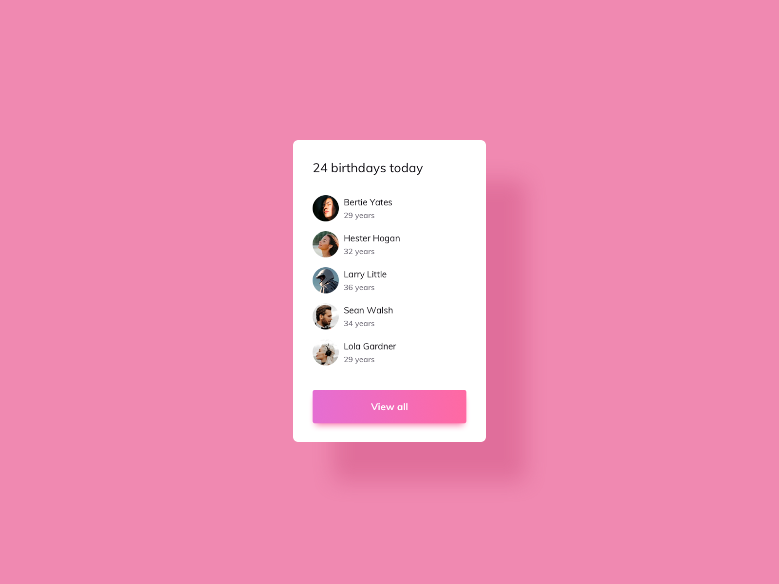
06_BirthdayList
设计稿
代码
  Document


    24 birthdays today
     Bertie Yates 29 years
     Hester Hogan 32 years
     LorryLttle 32 years
     Bertie Yates 29 years
     Bertie Yates 29 years
    View all
Bertie Yates 29 years
Hester Hogan 32 years
LorryLttle 32 years
Bertie Yates 29 years
Bertie Yates 29 years
View all
* {
    box-sizing: border-box;
}
body {
    background: #f089b1;
    display: flex;
    align-items: center;
    justify-content: center;
    margin: 0;
    min-height: 100vh;
}
.list-wrapper {
    display: flex;
    flex-direction: column;
    align-items: flex-start;
    padding: 40px;
    background: #fff;
    border-radius: 0.5rem;
    box-shadow: 70px 50px 40px rgb(226, 112, 158);
    gap: 1.2rem;
    width: 30%;
    /* height: 30rem; */
    max-width: 700px;
    overflow: hidden;
}
h3 {
    font-weight: normal;
    white-space: nowrap;
    margin: 0;
}
.list {
    width: 100%;
    display: flex;
    align-items: center;
}
.list img {
    min-width: 25px;
    height: 25px;
    border-radius: 50%;
    background-color: aqua;
    margin-right: 8px;
}
.list-name {
    display: flex;
    flex-direction: column;
}
.list-name span:nth-of-type(2) {
    font-size: 13px;
    color: #9b9899;
}
button {
    width: 100%;
    height: 40px;
    color: #fff;
    border: none;
    border-radius: 0.2em;
    background-image: linear-gradient(to right, #e76ecf, #fe69a4);
    box-shadow: 0px 5px 4px rgba(246, 89, 194, 0.3);
}
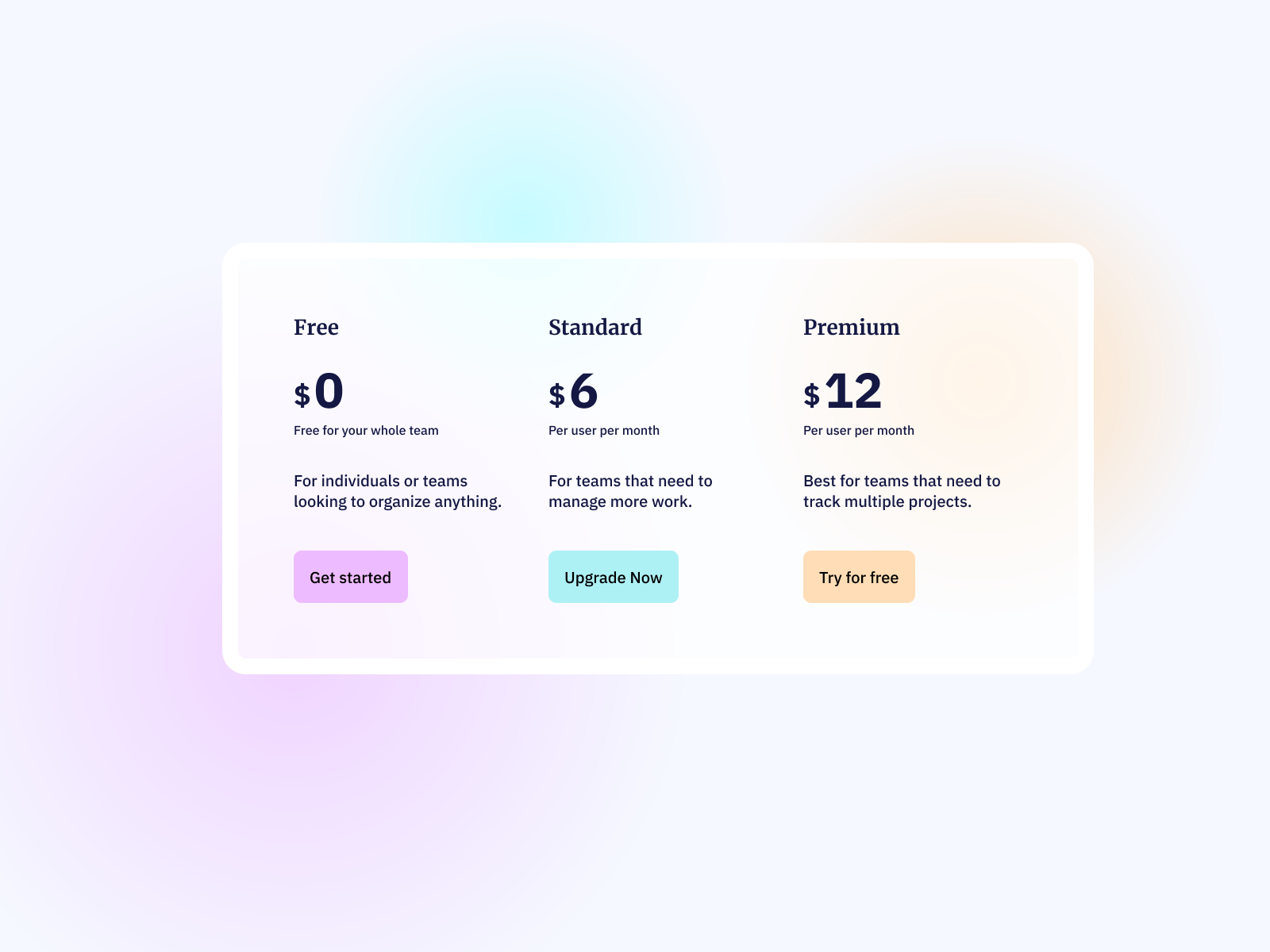
07_Pricing Table
设计稿
代码
Document
Free
$ 0Free oyour whole team
For individuals or teams looking to organize anything.
Get startedStandard
$ 6Peruser per month
For teams that need to manage more work.
Upgrade NowPremium
$ 12Peruser per month
Best for teams that need to track multiple projects.
Try for free
* {
  box-sizing: border-box;
}
body {
  background-color: #f5f8ff;
  display: flex;
  align-items: center;
  justify-content: center;
  margin: 0;
  min-height: 100vh;
}
li {
  list-style: none;
  /* 移除列表项前的符号 */
  margin: 0;
  /* 重置外边距 */
  padding: 0;
  /* 重置内边距 */
}
.table-wrapper {
  position: relative;
  min-height: 50vh;
  min-width: 625px;
  border: 15px solid #fff;
  border-radius: 10px;
  background-color: rgba(255, 255, 255, .7);
  /* overflow: hidden; */
}
.table-list {
  display: flex;
  gap: 2rem;
  max-width: 800px;
}
.list-price span:nth-of-type(1) {
  font-size: 20px;
  font-weight: bold;
}
.list-price span:nth-of-type(2) {
  font-size: 40px;
  font-weight: bold;
}
p {
  font-size: 18px;
}
.list-pack {
  margin: 0;
  font-size: 12px;
}
button {
  border: none;
  width: 7rem;
  height: 40px;
  border-radius: 5px;
}
.table-list li:nth-of-type(1) button {
  background-color: #edbbff;
}
.table-list li:nth-of-type(2) button {
  background-color: #aef1f5;
}
.table-list li:nth-of-type(3) button {
  background-color: #ffddb6;
}
.halo {
  position: absolute;
  top: 4rem;
  left: 20rem;
  /* background-color: #edbbff; */
  width: 15rem;
  height: 15rem;
  border-radius: 50%;
}
.purple {
  /* position: absolute; */
  top: 13rem;
  left: -8rem;
  width: 20rem;
  height: 20rem;
  /* background-color: #edbbff; */
  background-image: radial-gradient(circle, rgba(237, 187, 255, 1) 0%, rgba(237, 187, 255, 0) 100%);
  box-shadow: 0 20px 70px rgba(237, 187, 255, 0.2),
      /* 下阴影 */
      0 -20px 70px rgba(237, 187, 255, 0.2),
      /* 上阴影 */
      20px 0 70px rgba(237, 187, 255, 0.2),
      /* 右阴影 */
      -20px 0 70px rgba(237, 187, 255, 0.2);
  /* 左阴影 */
  z-index: -5;
}
.blue {
  /* background-color: #aef1f5; */
  top: -6rem;
  left: 10rem;
  background-image: radial-gradient(circle, rgba(174, 241, 245, 1) 0%, rgba(237, 187, 255, 0) 100%);
  box-shadow: 0 20px 70px rgba(174, 241, 245, 0.2),
      /* 下阴影 */
      0 -20px 70px rgba(174, 241, 245, 0.2),
      /* 上阴影 */
      20px 0 70px rgba(174, 241, 245, 0.2),
      /* 右阴影 */
      -20px 0 70px rgba(174, 241, 245, 0.2);
  /* 左阴影 */
  z-index: -5;
}
.yellow {
  top: -3rem;
  left: 40rem;
  /* background-color: #ffddb6; */
  background-image: radial-gradient(circle, rgba(255, 221, 182, 1) 0%, rgba(237, 187, 255, 0) 100%);
  box-shadow: 0 20px 70px rgba(255, 221, 182, 0.2),
      /* 下阴影 */
      0 -20px 70px rgba(255, 221, 182, 0.2),
      /* 上阴影 */
      20px 0 70px rgba(255, 221, 182, 0.2),
      /* 右阴影 */
      -20px 0 70px rgba(255, 221, 182, 0.2);
  /* 左阴影 */
  z-index: -5;
}


